The mark is not designed. It is grown.
Every logo tells you about the thing it names. Ours starts with a question: what does a turmeric rhizome look like on the inside? Not metaphorically. Literally. The mark is built from real cross-section data. What follows is how it got there.
trmeric, for those who want to ascend.
Before the mark could take form, the brand needed a position. Four values anchored it: Simply essential. Superpower approach. Do it with style. Uplifting experience. These four quadrants became the brief for everything that followed, including the geometry of the logo itself.
The five rings in the final mark are not decorative. Each one carries one of these values, plus a fifth: Unleash potential, the culmination of the other four.
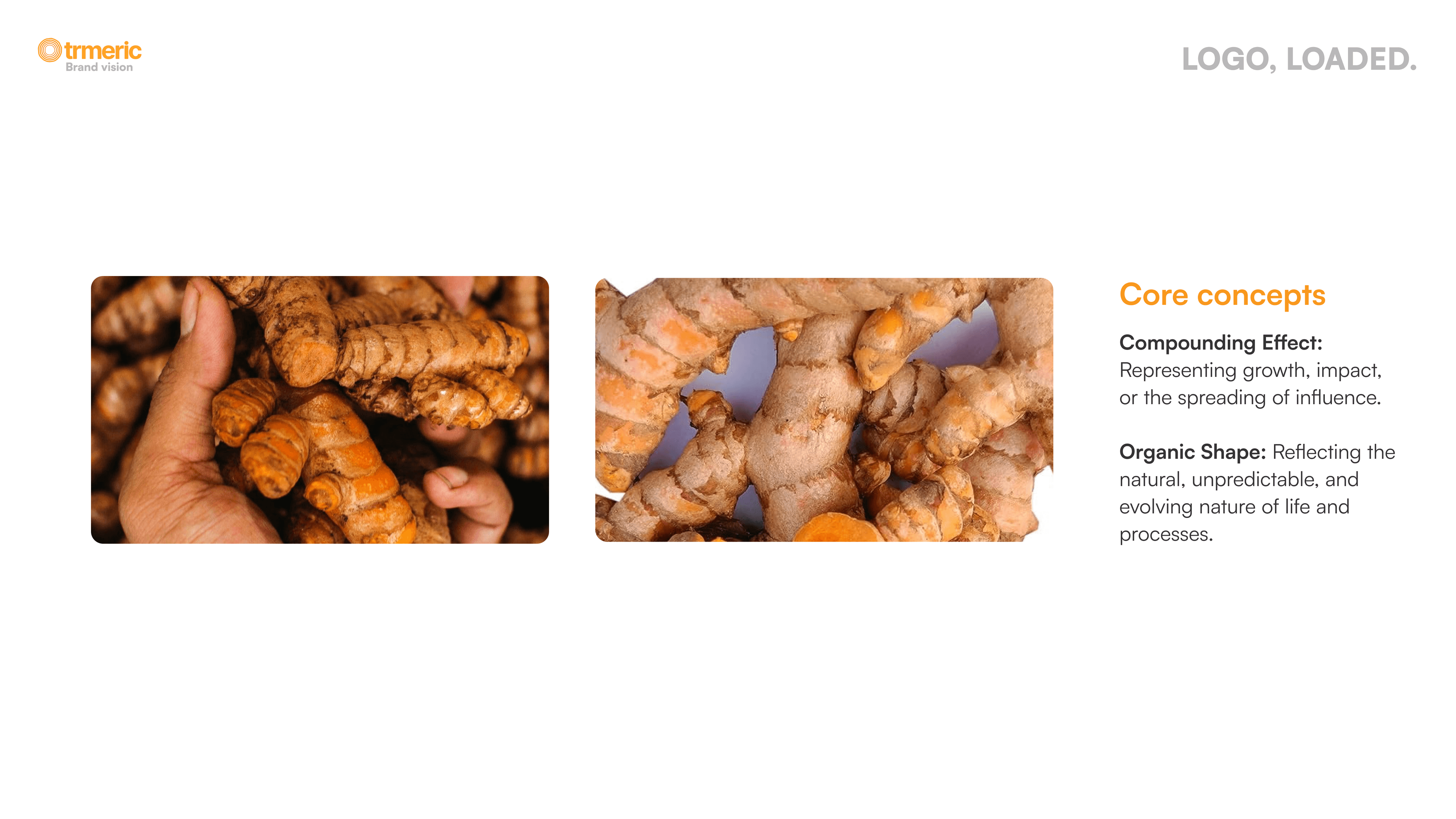
It started with an actual turmeric plant.
Two core concepts emerged from studying the plant directly. The first: the compounding effect, turmeric grows rhizome by rhizome, each new bulb branching from the last, representing growth and the spreading of influence. The second: organic shape, no two bulbs are the same. The form is natural, unpredictable, and alive.
These are not metaphors bolted onto a geometric logo after the fact. They are the literal source of the mark.
18 cross-sections. 3 groups. 1 mark.
Three primary rhizomes were selected. Each was sliced into six cross-sections and photographed at scale. The sections were traced and averaged in threes into six ring forms (1+2+3 = a, on through 16+17+18 = f), then paired and superimposed (a+b = X, c+d = Y, e+f = Z) to find the best organic shape. The final outline emerged from X+Y+Z: not a circle, but something that came from real plant geometry.
Five rings. Five brand promises.
The five rings within the mark are not concentric for aesthetic reasons. Each ring represents a pillar of what trmeric delivers, and they grow outward the same way trmeric's value compounds in an enterprise: starting small and essential, expanding to something that truly unleashes potential.
The turmeric gradient. Five steps, one journey.
The five ring colors step from warm amber (#FFA426) to deep burnt orange (#FF7300), the exact gradient inside a freshly cut turmeric rhizome. Outer ring lightest, innermost most saturated, the deeper you go, the more concentrated the colour.
It is the same sequence you watched in the construction above, expressed a second time — once in thickness, once in hue. One number runs through both, not eyeballed to "look about right." Colour earns its place by carrying the system, not decorating it.
Simple shapes. All contexts.
The logo is constructed from simple shapes so it maintains legibility at every size. Minimum height: 32px. The horizontal lockup is the default. On dark backgrounds the mark renders in amber. On amber backgrounds it reverses to white. The mark was designed to work in all three without modification, because a brand that only works on white backgrounds has not been properly finished.
The mark is one artefact. The product it names has 23 surfaces.